Plant Pals
Plant Pals is a playful mobile task management application paired with a virtual pet encouraging college students to seek out a healthy work-life balance.
Final deliverables were a digital prototype, demo video, literature review, and final paper.
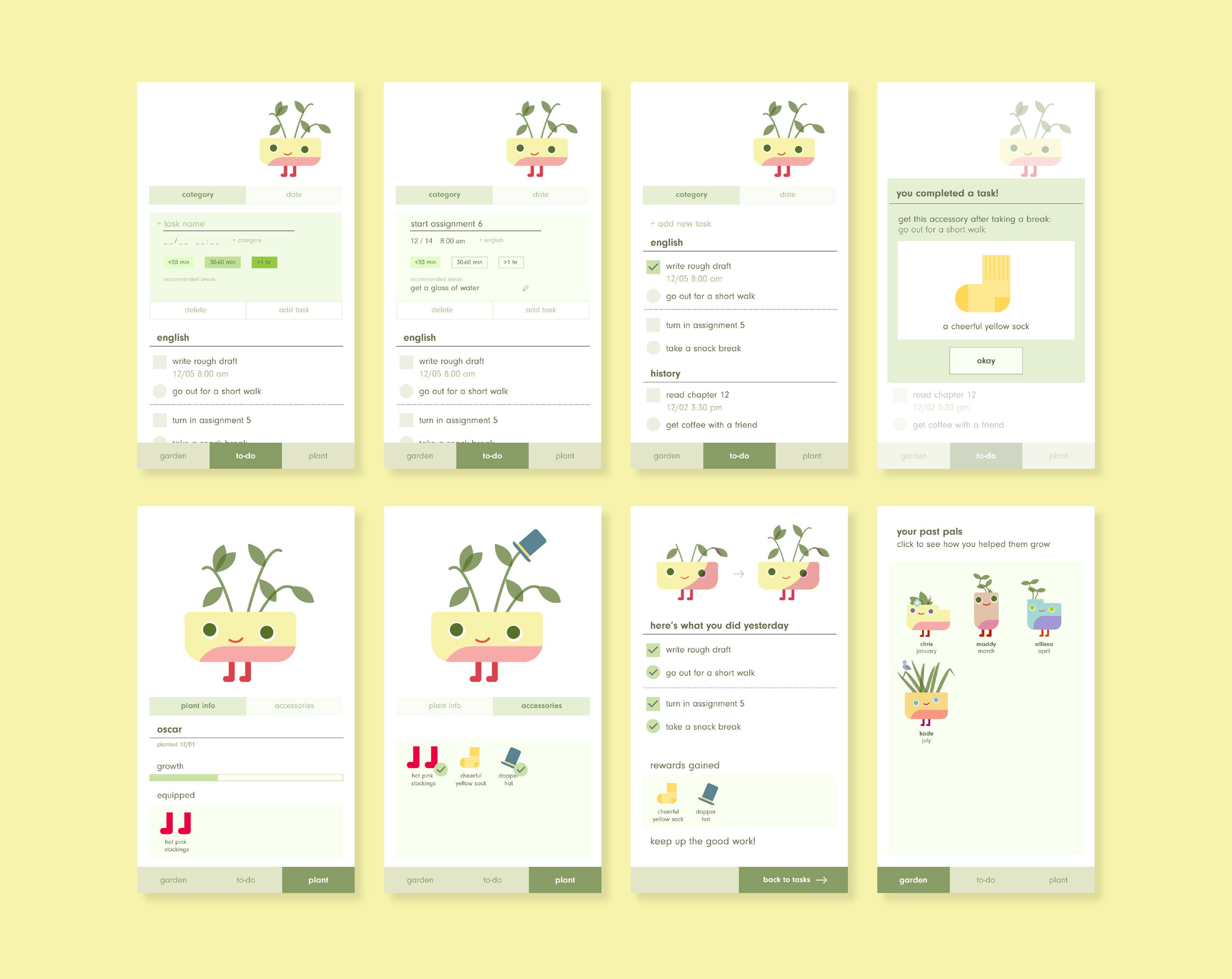
↑ Final prototype screens
Initial Research
Before we began, we wanted to understand the current state of students and how they manage their course-related tasks. By polling students, we found that those who do use pre-existing task management applications find them helpful, but really only use them when they feel overwhelmed and can't remember everything. Additionally, of those who write to-do lists for themselves, students were evenly split between listing the task as a whole, and listing smaller sub-goals.
Given those results, we wanted our project to be versatile—catering to students with a broad range of task-management behaviors, as well as encouraging them to take intentional breaks from work.
Given that this project was also intended to effectively utilize psychological principles of persuasion, we conducted a literature review to investigate task management, motivation, and the efficacy of virtual pets.
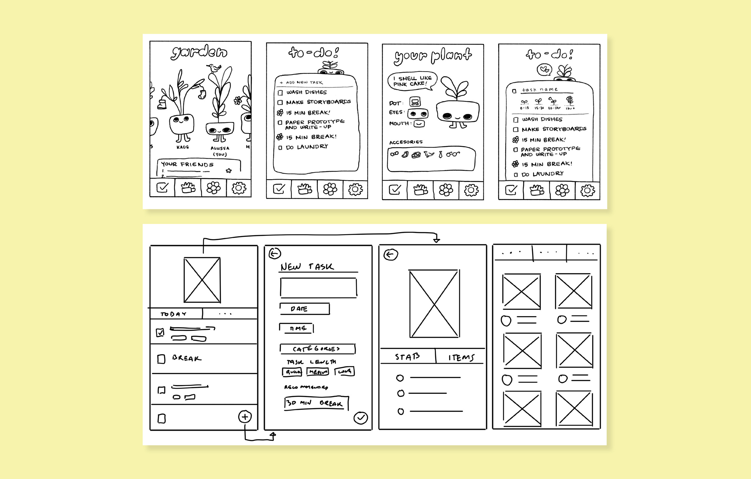
Paper Prototyping
Our concept emphasized self-care and striking a healthy work-life balance, so we felt that charming visuals would help make a user's workload feel less daunting—plus we just wanted it to be fun to use.
User testing here showed that users were confused with how breaks would be determined, since breaks were initially time-based and not every task requires the same amount of effort. Coupled with our literature showing that time-baased breaks can wind up causing even more stress, we shifted our task/break system to provide specific break recommendations based on task length (going for a walk, getting a snack with a friend, etc.).
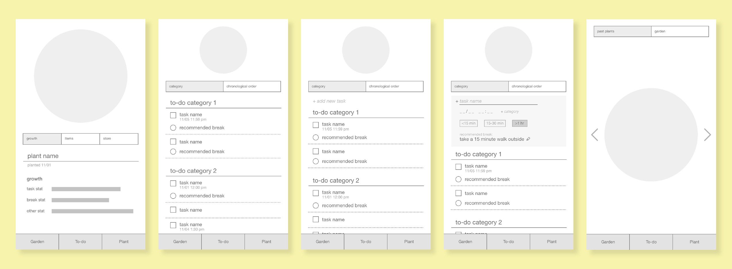
Low Fidelity Prototyping
This stage was focused on the structure and system of the application.
Users appreciated the ease of adding tasks in this system, as well as being able to organize their tasks by date, time, and topic (particularly for class-based tasks). It also confirmed that it's difficult for people to estimate the amount of time a task might take, so we chose to have users classify tasks as short, medium, or long instead. Users confirmed that having specific, but doable, recommendations made them more likely to actually do them.

Mid-Fidelity Prototyping
We wanted more feedback on our reward system, and also develop the visuals for the application. To do so, we made a handful of screens to illustrate the flow of task creation and completion.
The feedback loop made more sense to users now that there was a virtual pet to visualize their growth.

Final Prototype
We streamlined our task/break/reward system to provide a reward once the user has done a task as well as its associated break activity to emphasize our focus on pacing and self-care. Additionally, the user would start with a new plant each month to keep things fresh. However, users were also really font of their plant, so we created a Garden system where past plants could be viewed.
